


Can one chart change how you view your finances? Charts do more than display numbers. They take rows of data and turn them into clear visuals that show trends and help you compare key figures.
In a market that shifts quickly, these visuals highlight important changes that can boost your market confidence. This guide explains how different types of charts, like line charts and bar charts, can simplify your analysis in just a few quick looks.
Your next step: Pick one set of your data and use an online chart tool to create a basic line or bar chart. See which trends stand out and note how this simple visual can shape your next decision.
Essential Finance Chart Types
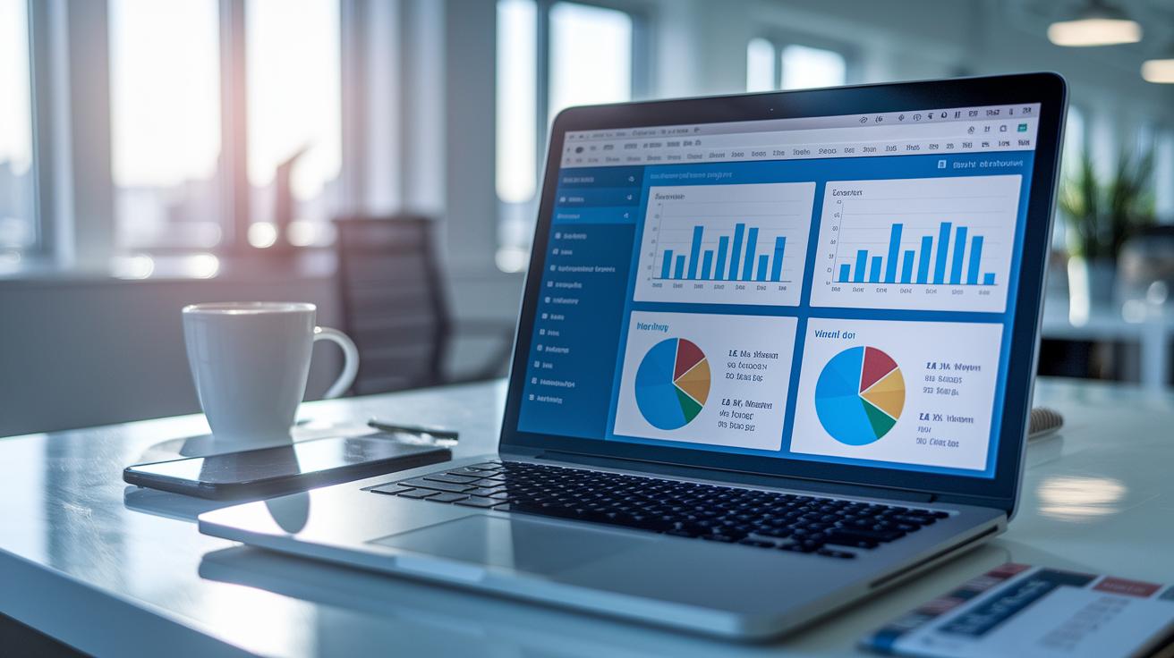
Finance charts change rows of numbers into clear stories that show trends and differences. They give you a quick look at financial data, whether you want to see how things change over time or compare different groups. These charts are key when you need to compare values, track changes, or show parts of a whole.
Different chart styles tell different data stories. When you pick the right type, you can spot the key numbers fast. For example, if you're tracking a simple trend, a line chart works best. On the other hand, if you need to compare categories, a bar or column chart is the way to go.
- Bar chart: shows data points side by side for easy comparison.
- Column chart: uses vertical bars to highlight changes over time.
- Scatter chart: plots two sets of numbers against each other to show their relationship.
- Pie chart: splits a whole into slices to show proportions.
- Line chart: connects data points to show trends over time.
Decide on the chart type based on what you want your data to say. If you need to spot trends, try a line chart. If you're highlighting parts of a total, a pie chart might be best. Experiment with different charts until you find the one that clearly tells the story of your numbers.
Interactive Finance Charts and Tools
Interactive chart platforms let you explore data in real time. They help you jump into details, update visuals quickly, and build charts with just a few clicks. For instance, many tools offer Mekko and Waterfall charts so you can spot trends and compare numbers at a glance. You can easily adjust the setup to tell your specific data story.
Want quick wins? Many platforms include extra lessons like masterclasses on choosing the right chart and simple guides for setting up licenses. They also share regular updates so you always know about the latest features. With these resources, you not only get a tool but also learn how to use it effectively in everyday data work.
Check out a real-life example: The “I Heart Keenwah” case from March 2, 2016. Users there took advantage of dynamic chart automation and real-time updates to clearly show market trends. This example shows that turning raw data into a clear and powerful story is easier than you might think.
Your next step: Find out if your current data tool offers interactive features. Try adjusting one of your charts today to see the difference it can make.
Real-Time Market Graphs for Live Decision-Making
Traders and analysts rely on up-to-date market graphs to spot every change in stock performance quickly. When data updates lag by even a few seconds, it can lead to missed opportunities. To avoid this, use direct data updates that keep your charts in sync with the latest numbers. This way, you can track trends and make decisions on the spot without second-guessing the data.
Stick with simple line and bar charts for the clearest view of market movements. Testing different chart types can help you find the format that best shows real-time changes. Avoid extra design details that may confuse or slow down your live updates.
Here are a few tips to keep your graphs sharp:
| Tip | Why It Matters |
|---|---|
| Skip 3D effects | They can hide important details. |
| Avoid overly complex graphics | Simpler visuals update faster. |
| Keep the design clean | It makes trends easier to spot. |
Try updating your charts now with these practices and see how they improve your decision-making process.
Technical Analysis Charts in Finance

Technical analysis charts let you see market trends and predict moves using past price data. They show key price points, open, high, low, and close, so you can quickly understand what’s happening. Recognizing patterns like doji or engulfing can help spot when trends might reverse. This clarity makes it easier to decide when to buy or sell.
Candlestick Chart
Candlestick charts display daily price moves with colored blocks and thin lines. They clearly mark the open, high, low, and close prices. For example, a long block with short lines may signal strong buying or selling pressure. This helps you quickly gauge market sentiment.
Bar Chart
Bar charts use vertical bars to show price data. Each bar represents the open, high, low, and close prices. They are simple and easy to read. By comparing one bar to the next, you can spot shifts in momentum and volume, which helps you understand market behavior.
Point & Figure Chart
Point & Figure charts use a grid system where price changes are marked with X’s and O’s, without showing time. This approach removes extra details, so you only see price movements. Traders use these charts to find long-term trends and key support or resistance levels.
Heikin-Ashi Chart
Heikin-Ashi charts change traditional candlestick patterns by using averaged data. This smooths out price swings and gives you a clearer view of trends. It’s especially useful for filtering out noise in volatile markets.
Your next step: Try exploring a free online charting tool. Spend a few minutes checking out each type of chart and note how they display price data. This small exercise will boost your confidence in spotting trends and making smart trading decisions.
Finance charts Spark Fresh Market Optimism
Many finance visualization platforms let you test their features before committing to a purchase. You can start with a free trial and then choose a plan that fits your needs. Options like Manage License, Buy Now, and Free Trial guide you through the setup process. Some platforms even include FP&A and treasury certification programs along with member-only toolkits so you can boost your skills as you upgrade your software.
Excel has long been a staple for basic financial reporting and data visualization because of its familiar custom formulas and pivot tables. However, modern finance tools do more. They offer real-time data updates, interactive charts, and easy reporting that turn your numbers into clear, actionable insights. Plus, with built-in update notes and regular software improvements, your reporting tools stay in step with current market demands.
When you compare Excel with dedicated finance software, the difference is clear. Specialized tools come with easy-to-use dashboards crafted for finance charts. You can drill down into data, change reporting details on the fly, and use ready-made templates to cut down on manual work. In Excel, matching these features might involve complex formulas and extra add-ins, which can slow you down when you’re busy.
Specialized platforms also provide customizable financial templates and smooth integration with other tools. Try this: use pre-built chart templates that you can adjust to match your data API feeds and reporting schedules for a quick and efficient setup.
Your Next Step: Choose one finance visualization tool that offers a free trial and explore its dashboard features to see how you can turn raw data into real action steps.
Final Words
In the action, we broke down finance chart types and tools that help you understand your money. We showcased basics like line, bar, and candlestick charts alongside interactive options for real-time decisions and analysis.
The guide offers clear steps for choosing the right chart based on your data and goals. Pick a style, explore a tool, and take your next step in financial clarity. Embrace these finance charts to empower smarter money moves today.
FAQ
What free finance charts tools and templates are available?
The free finance charts tools include online graph makers that offer customizable chart templates and simple design features. They help you create clear visuals for tracking financial data without extra costs.
What information do financial charts and graphs provide?
Financial charts and graphs display data trends, comparisons, and patterns using different chart types such as line, bar, and pie. They help simplify complex financial information for quicker understanding.
How can I view finance charts for popular stocks like SPY, Google, QQQ, and Meta?
Finance chart searches for SPY, Google, QQQ, and Meta refer to stock data visualizations. Online platforms and brokerage tools offer detailed charts that show historical and live market moves for these tickers.
Which finance graph maker tools are beginner-friendly?
Beginner-friendly finance graph maker tools feature drag-and-drop interfaces with easy customization options. They allow you to quickly build visual representations of financial data with minimal learning curve.


